What is Merchandising?
Merchandising is a retail strategy that promotes products and influences customer behavior in order to increase sales.
Products can be displayed or presented in creative ways to entice customers to purchase. This can be through pricing, special offers, visual displays and other techniques.
Merchandising is not a one-size-fits-all system, the strategy should vary according to different variables. The product category makes a difference, for example, different strategies would be needed for:
- Perishable goods
- Apparel
- Heavy machinery
Similarly, different shoppers’ purchasing behavior require different merchandising, such as
- Repeat purchases throughout the year
- Once in a year purchase
- Inspirational purchasing
On top of this, specific business objectives are factored in, as well as other considerations. Examples of these objectives include
- Increasing sales
- Improving customer loyalty
- Driving traffic
- Raising brand awareness
Although the fundamentals of merchandising might stay the same, strategies and techniques will differ. How first impressions are made, which lighting is used, how traffic is manipulated, which metrics are tracked and which principles are considered are all down to the individual business.
What Is Merchandising
Merchandising is as old as trade itself.
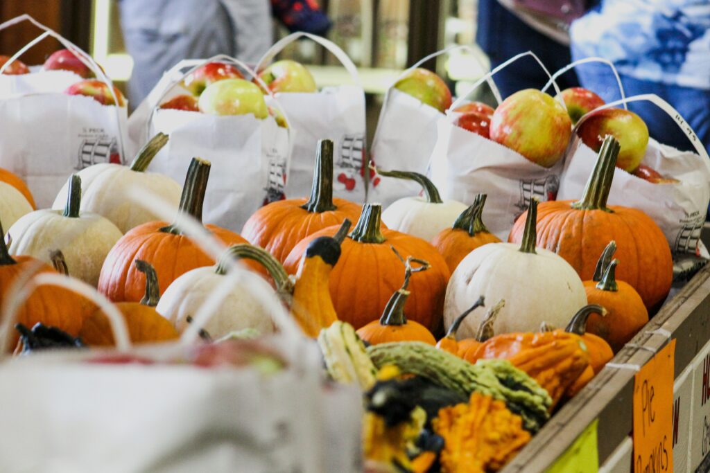
In order to sell, sellers must inspire the buyer to gain trust. In old markets, visual merchandising was important; placing the freshest, most vibrant products visibly, attracted sales. The importance of displays are important.
Displays are created depending on the business needs. If a vegetable seller has a low inventory of apples, he places them at the back so they don’t run out. If he has highly priced watermelons, he displays it front to attract attention.
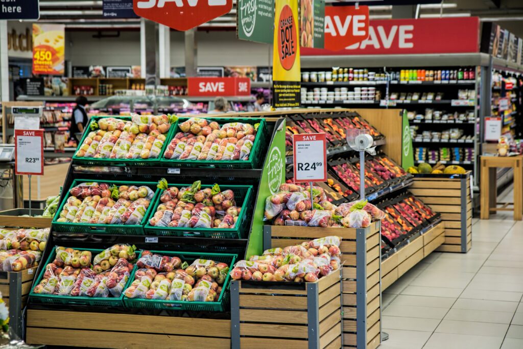
These business considerations translate to any merchandising strategy in the following terms: low inventory, sale items, end-of-season items, closing down sale, new arrivals, etc.
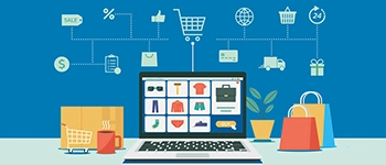
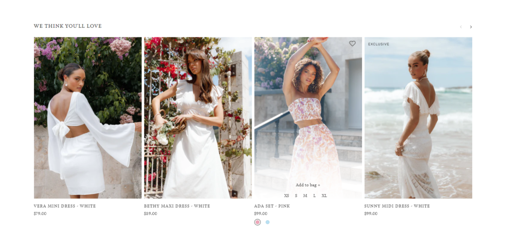
Online Merchandising
Over time, merchandising has grown in complexity, evolving to meet modern consumer demands. With the growth of eCommerce, online merchandising has given a whole new dimension to the art.
Consumer tastes & trends change quickly, styles and product lines are introduced at an accelerated pace, and everything is available on display 24 X 7. This puts more pressure on merchandisers who must use a variety of automation tools to keep up. Online merchandisers control the assortment and display of online store collections, search results, and even cross sell product recommendations. They use online merchandising tools such as visual merchandising editors, merchandising rule editors, merchandising strategies, and display optimizers to make products and collections enticing for shoppers to buy.
Achieving Merchandising
Merchandising can be achieved through a number of ways, such as:
- Appealing displays
- Shelf-signage
- Themes and bundles
- Free tasters
- Eye-placement sales
- Promotions
When done well, merchandising creates opportunities for cross-sell and upsell. It also demonstrates options whilst steering customers in the direction that’s best for your business.
Visual Merchandising
Merchandising begins with the eyes.
Present products in a visually favorable light to encourage purchases. Create this effect by making sure products are
- Clean
- Well organized
- Placed in a logical spot
- Spaced sufficiently
- Creatively displayed
Product design and packaging influence the buyer, when presented at the right time in the right way. Creatively tying in related products or accessories creates cross-sell and upsell opportunities to increase sales.
Merchandising Cycles
Merchandising cycles play a key role in merchandising. Some retailers make upwards of 80% of their sales during the holiday season, so holiday season merchandising strategies are crucial.
Seasonality is an important principle of merchandising. Cycles relate to cultural customs, holidays and seasonal events such as:
- Weather patterns
- School schedules
- Religious and secular holidays
These cycles are found all over the world. Decide how much you want to emphasize certain holidays depending on your strategy.
Why Merchandise?
When done effectively, merchandising
- Boost sales
- Speed up inventory turnover
- Helps businesses achieve their needs
From a customer perspective, the shoppers benefit from a smoother discovery journey that is also inspirational, increasing their satisfaction and boosting their customer loyalty.

Effective merchandising is a cost-effective way of boosting sales by optimizing the buying potential of shoppers who visit the store. The evolution of merchandising over the years it’s testament to the way the commercial culture and market has grown, but one truth remains glaring and constant over thousands of years: merchandising is a must.